Dappnode
View Live SiteWe partnered with DappNode to rejuvenate their brand identity and product positioning. This culminated in a revamped, user-centric website complete with a fully customisable e-commerce experience.
Deliverables
Team


Year
Challenge
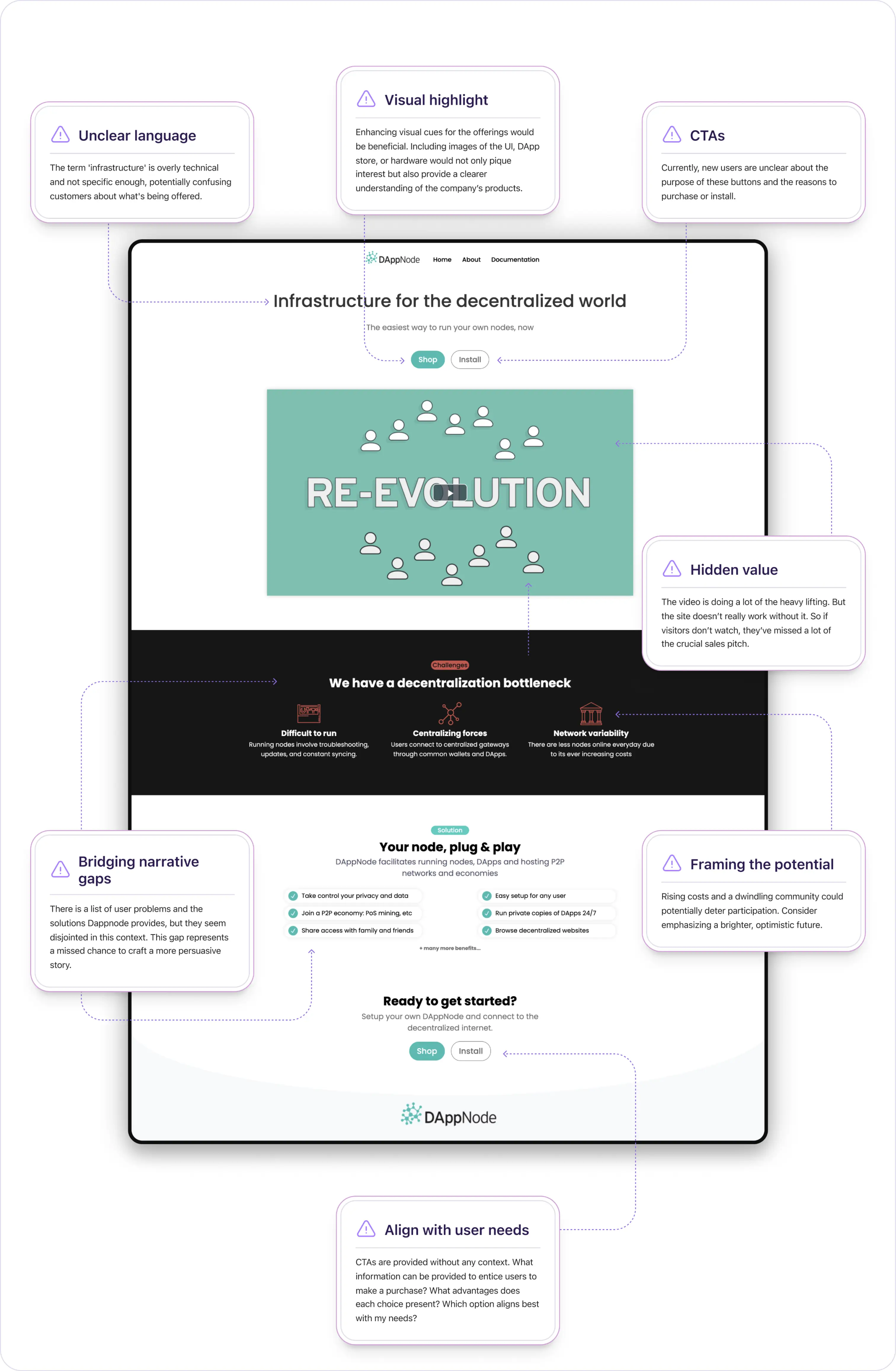
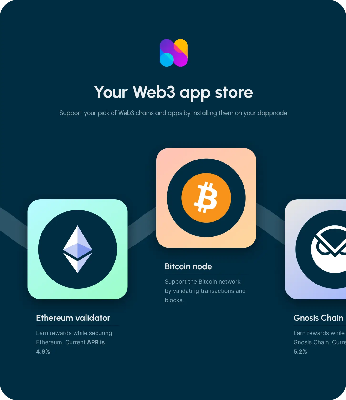
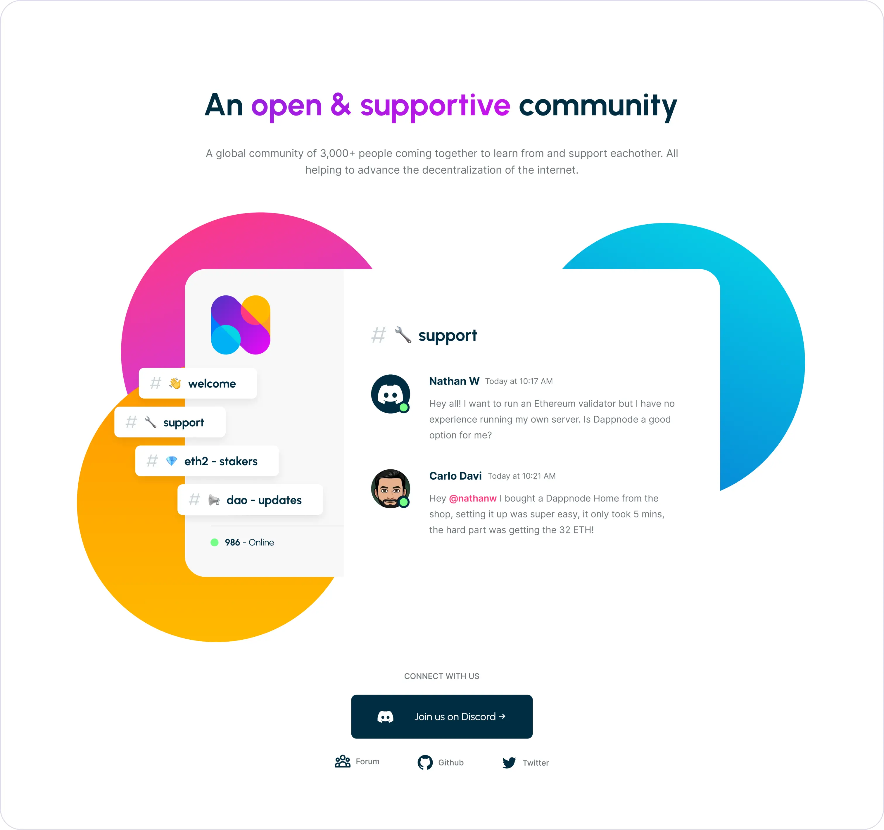
DAppNode is committed to advancing the decentralization of the internet. Their offering includes both hardware and software components, requiring users to construct and configure their personal node.
Amid growing competition in the decentralized internet space, DAppNode faced challenges in effectively conveying their value proposition to a wider audience. Their existing online presence was fragmented, and potential customers often found it challenging to navigate through and fully understand the myriad of product offerings.
Our partnership with DAppNode spanned multiple areas. Initially, they sought to enhance their product positioning, aiming to attract a broader audience. This also entailed refining their product messaging and elevating the visual identity of their brand and product.
To bring their vision to life, they tasked us with designing and building a new website. This site would not only spotlight their updated brand positioning and image but also provide a tailored e-commerce section, streamlining the process for both new and existing customers to explore and purchase DAppNode products.
Solution
Our preliminary research indicated that DAppNode's original brand positioning overly catered to technical users, neglecting a broader audience due to its complexity. The brand image did not resonate with the company’s core ideals, leading to confusion among potential customers.
In addressing these findings, we revamped the website's UX, focusing on its information architecture. We introduced the new brand and visual identity site-wide, emphasizing user-centric messaging based on research and team workshops.
Our color choices aimed for a modern, bold yet friendly palette with some harmonic tension. The logo was redesigned to be more friendly monogram/icon, less corporate in appearance, with vibrant colors. This could be then creatively applied across various branded assets for a cohesive look.
Additionally, a fully customizable e-commerce store was developed on Shopify to enhance the user shopping experience.
Retaining the original logo's network of nodes concept, our revamped design features a distinctive and bold monogram, with nodes interconnecting to craft the letter 'N'.
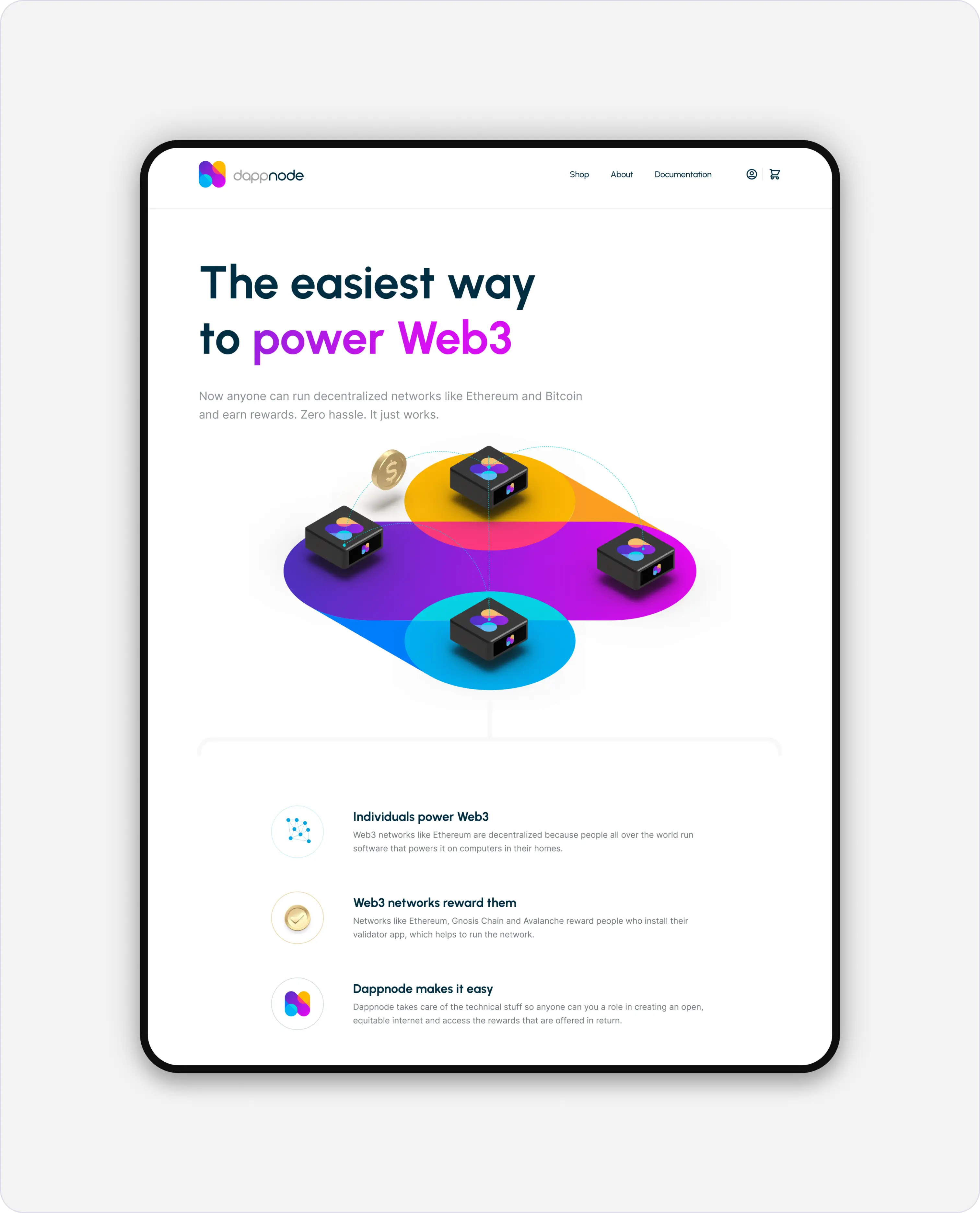
Enhanced brand positioning for a wider audience
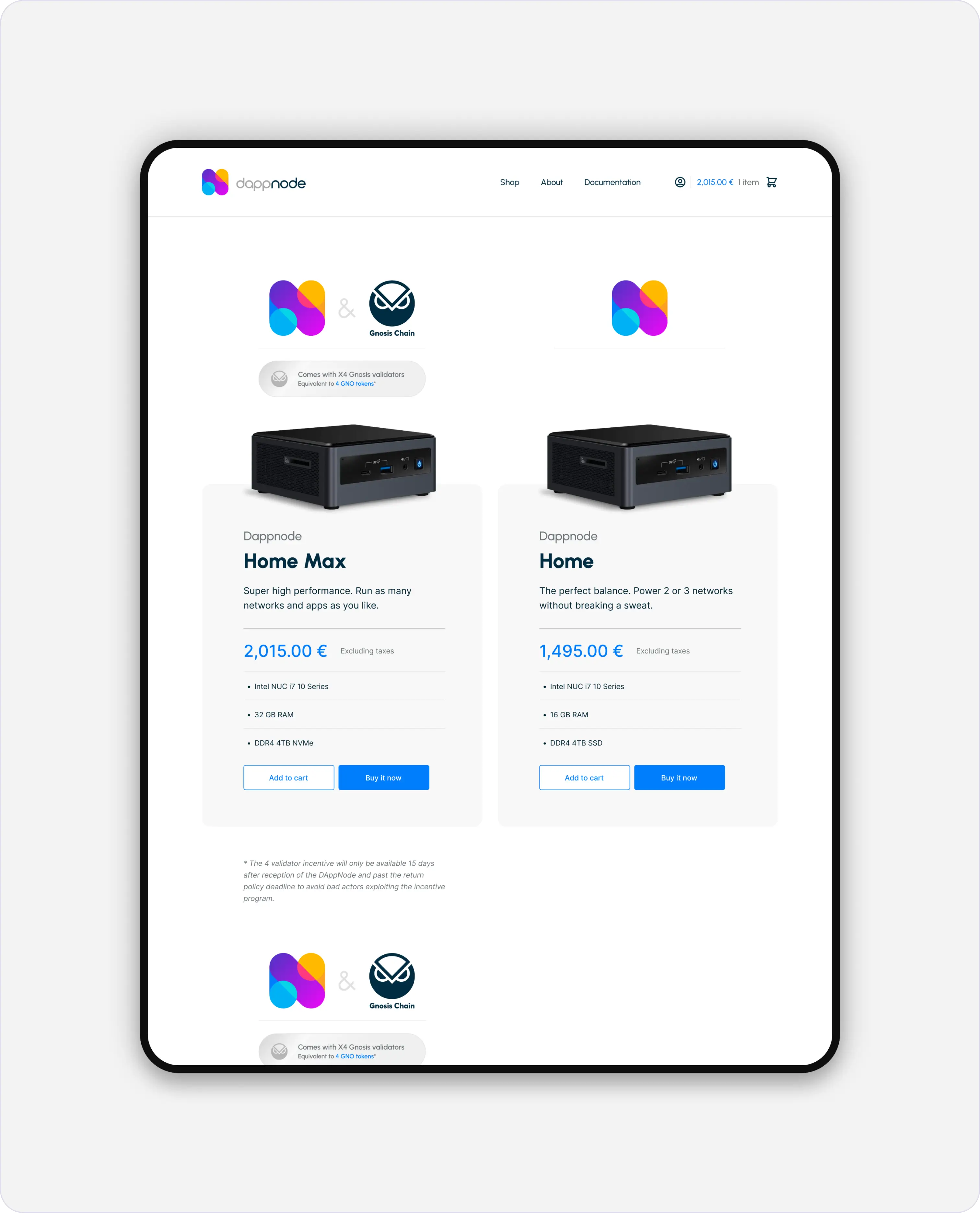
Simplified UI and content design provided users with an improved shopping experience
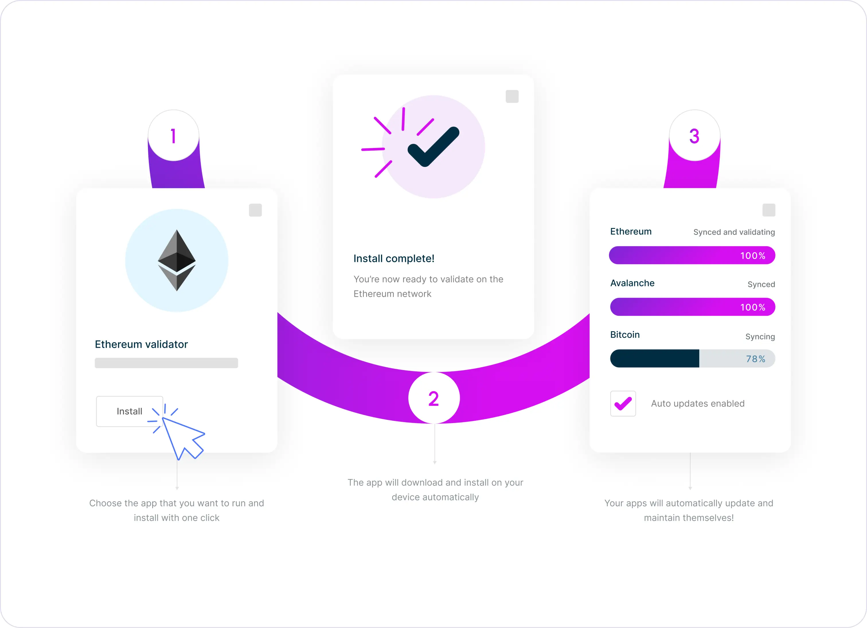
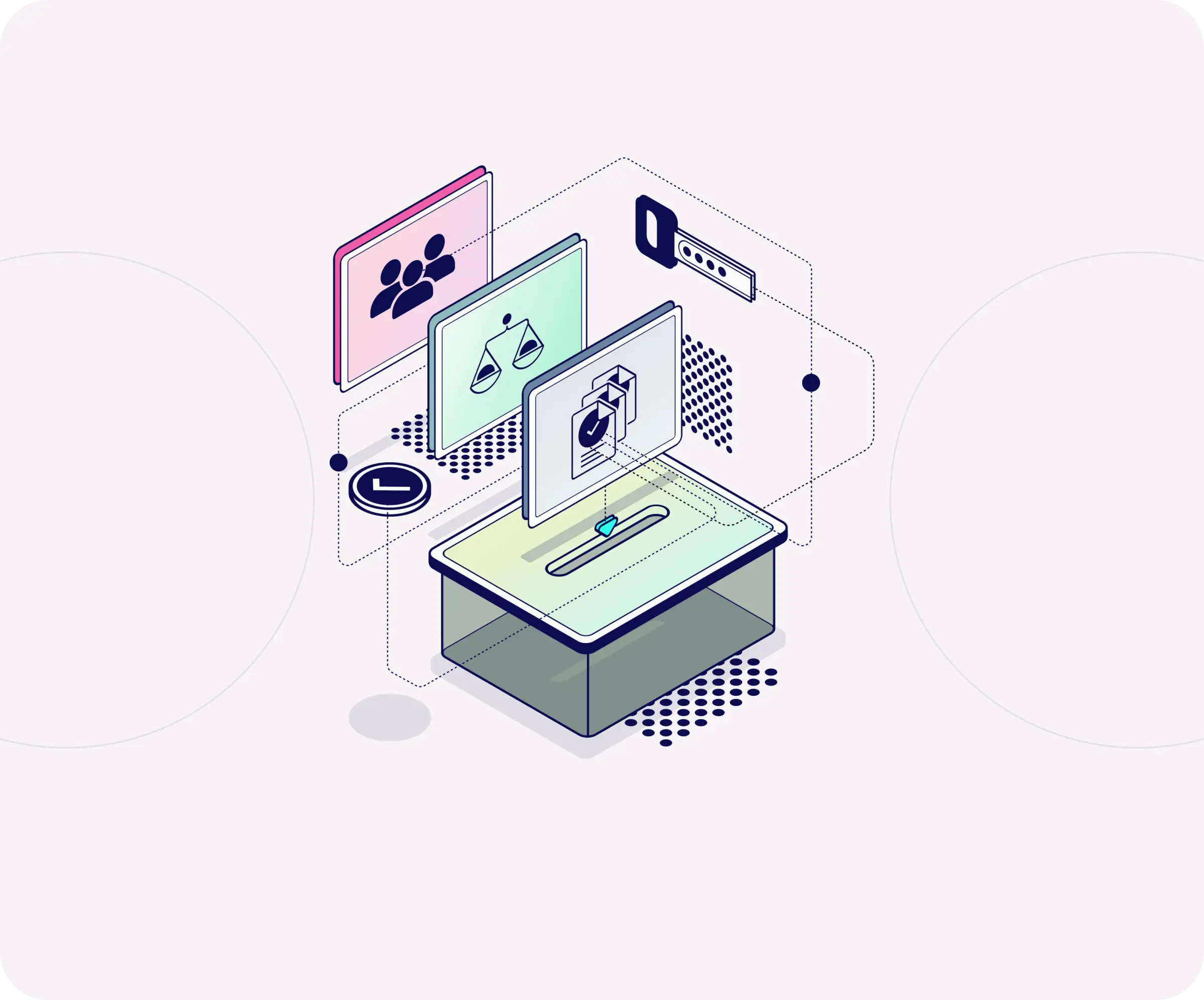
A step-by-step guide to simplify the setup and installation process.
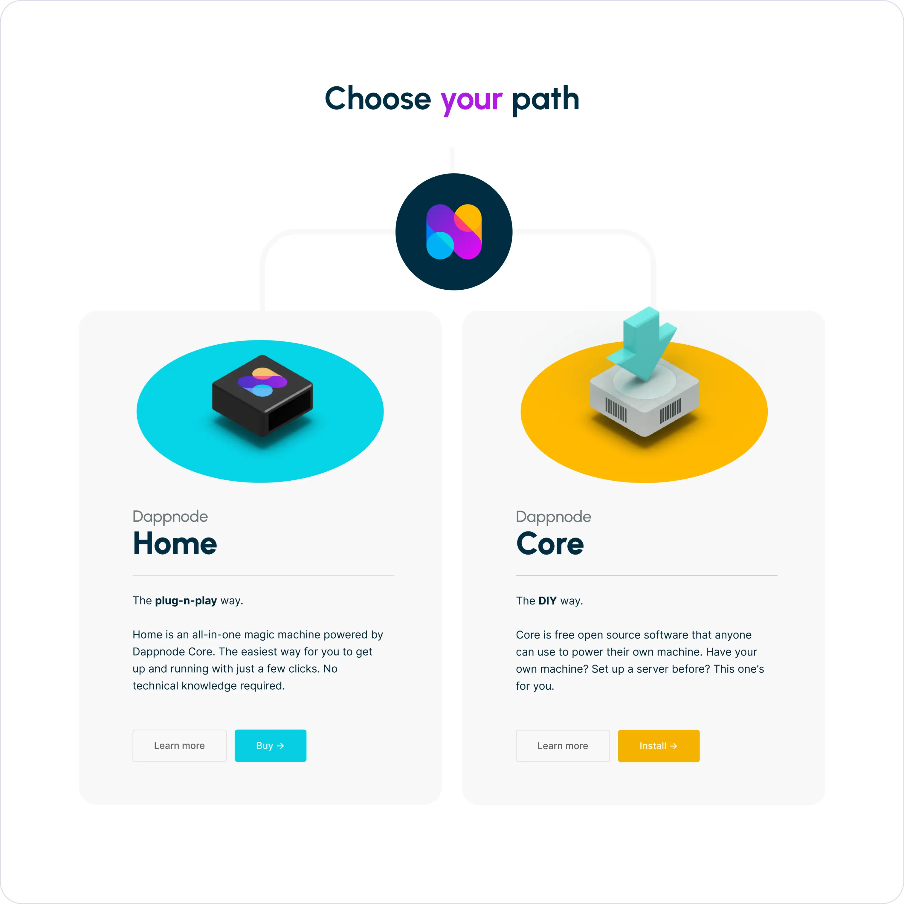
Clearer product positioning and differentiation between offerings streamlined the decision-making for different audience segments
Let’s chat
We'd love to learn about you and what you are building
or