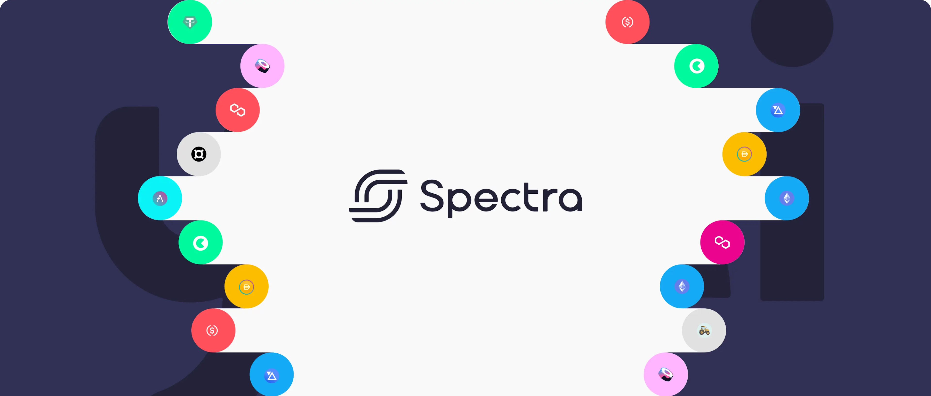
Spectra
View Live SiteWe collaborated with Spectra, a DeFi interest rate derivatives protocol, to reduce complexity in their product and breathe new life into their brand.
Deliverables
Team


Year
Challenge
Spectra (formerly APWine) is an open interest rate derivatives protocol. For this project, we worked alongside the leadership team on two fronts:
Redesigning the UI/UX of their core product
A total rebrand, including new name, logo and visual identity
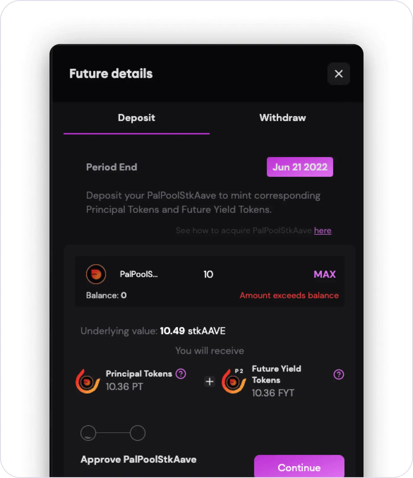
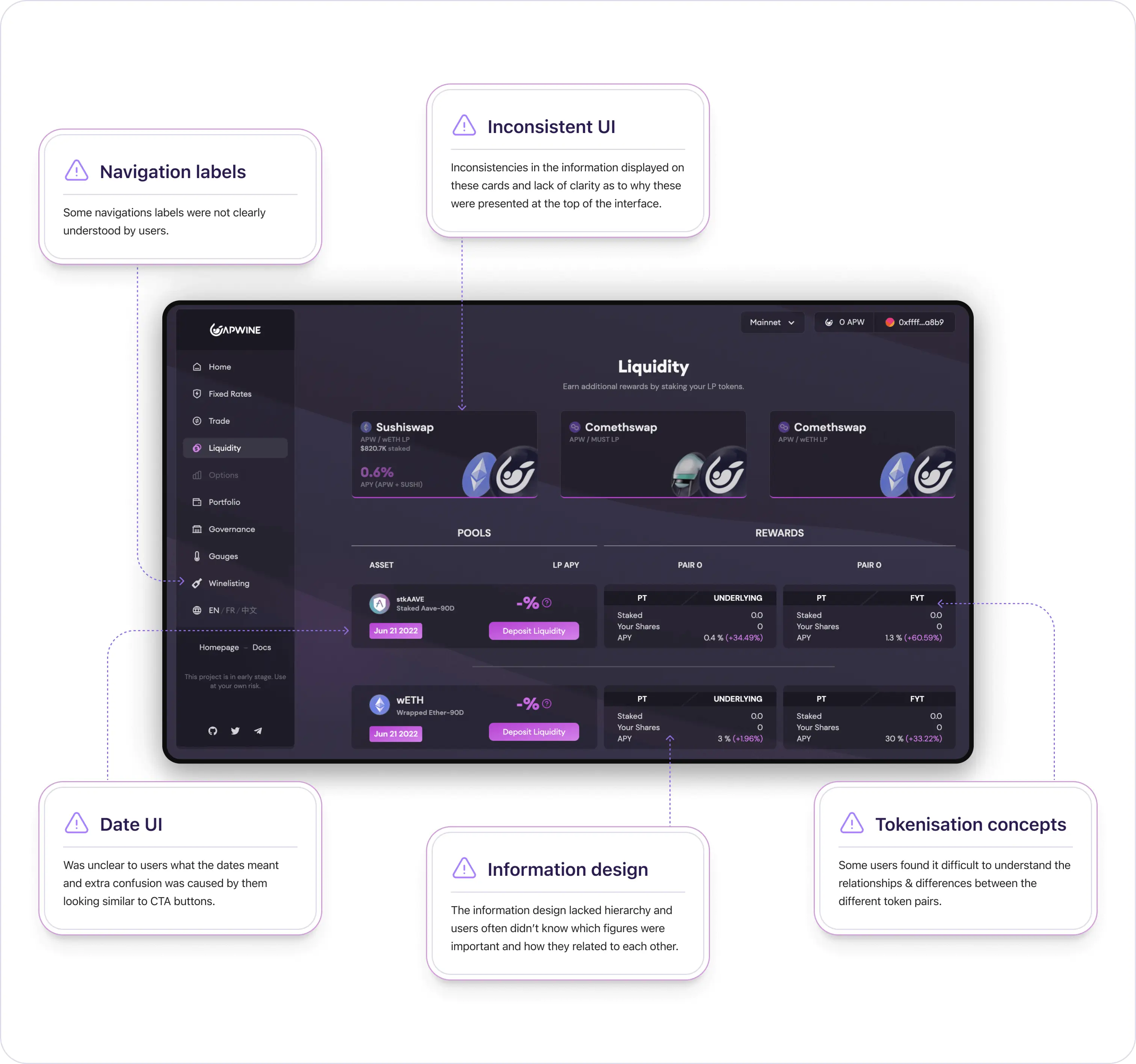
From a product perspective, the existing version of the platform provided users with a number of powerful financials tools at their disposal. However, some users found the underlying concepts difficult to understand and this sometimes resulted in users making costly errors or simply not engaging with the tools at all.
The main goal here was to redesign the user experience so it was less overwhelming, easier to use and ultimately democratise the yield market, so it could be used by more people.
The team also felt that the existing brand and visual language, while being deeply tied to their identity as a team, had a lot of inconsistencies, did a poor job of communicating what the product actually does and was not resonating with people in the wider crypto space.
Solution
After a series of workshops with the team and some competitive analysis sessions we emerged with a set of design principles which guided our approach throughout. These were focused on simplifying the product structure and language, in-app education, providing tools that make user feel empowered and confident and where possible have the system do the heavy lifting.
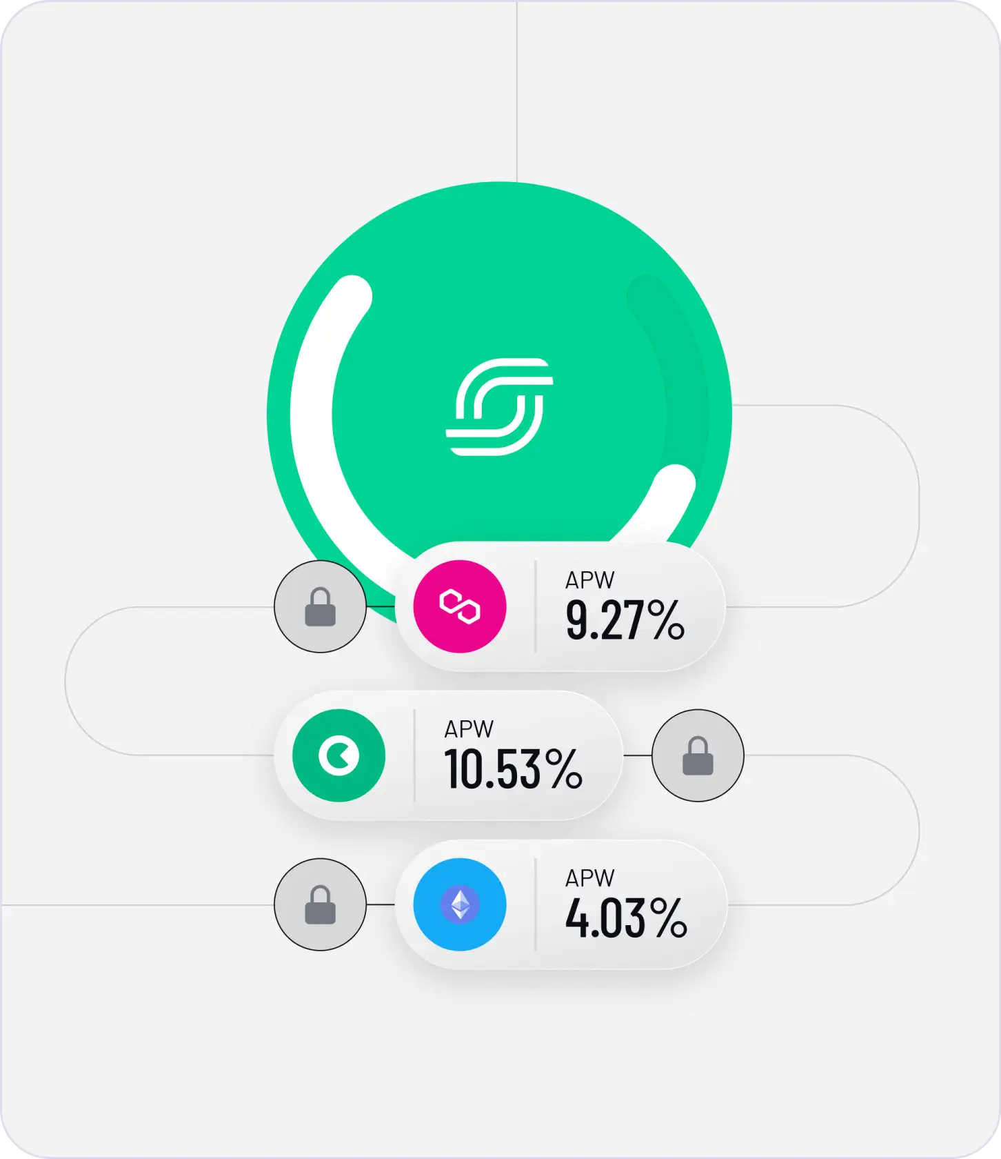
Our core focus was on creating a set of visual cues and interactions that behaved consistently across the app. This meant having a unified approach to how concepts such as time, tokenization and other core concepts were represented.
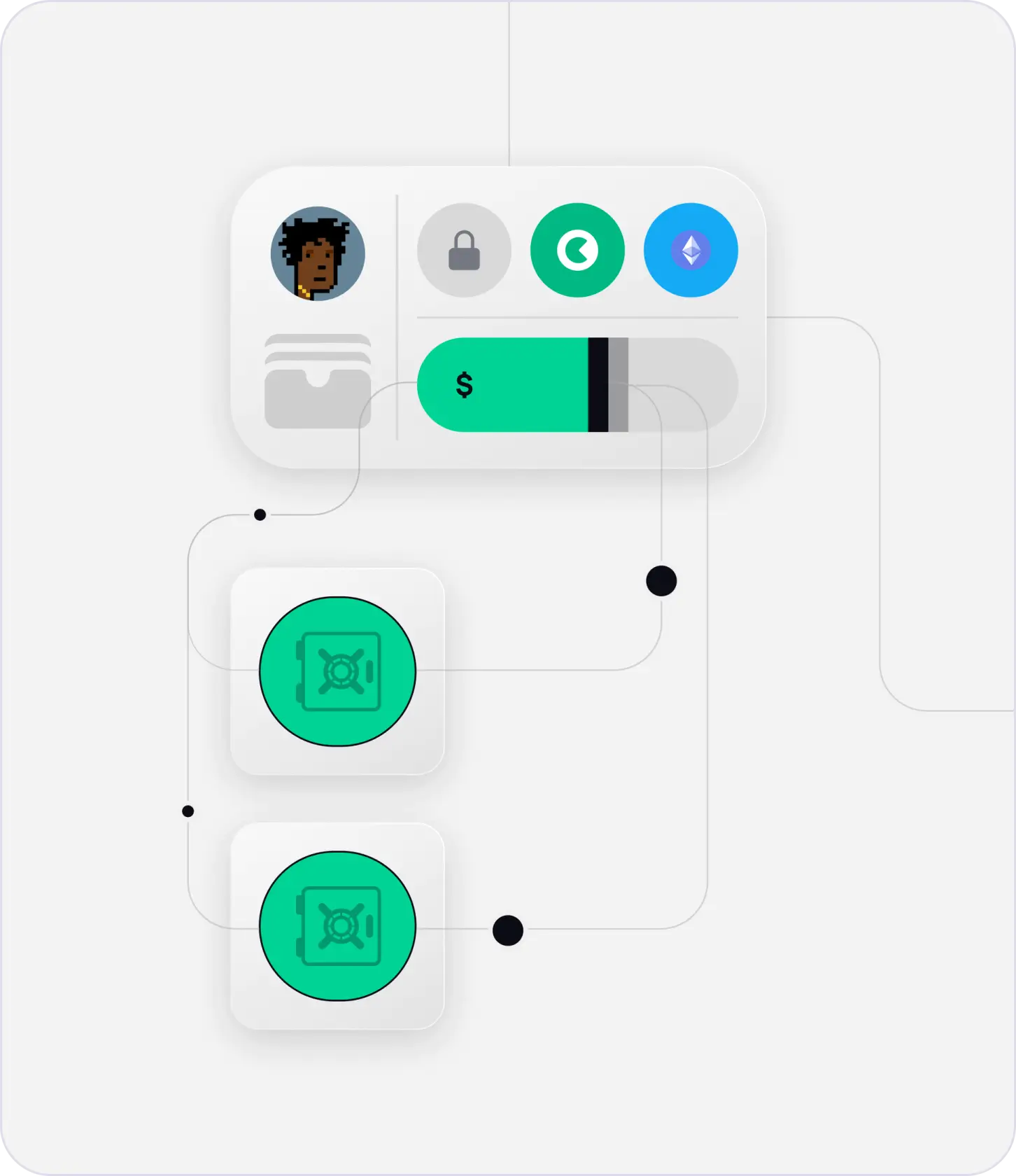
Previously, the app had several different patterns for how a user would carry out the primary tasks (deposit, withdraw, tokenizing, trading). We created a centralised design pattern that utilised an off screen drawer which could handle all of these tasks in a consistent manner regardless of where the user was located in the app. Thus, reducing the amount of cognitive load on users and increasing the overall usability of the product.
Another key design consideration was that of scale, with Spectra’s plans to introduce more third party tokens and platforms to its protocol we delivered a design system that could scale as capacity increased.
From a brand perspective, we guided the team through the process of re-naming their product to ‘Spectra’ as well as designing a new logo and set of brand guidelines. This ensured the logo could be used by the team and partners across a multitude of contexts.
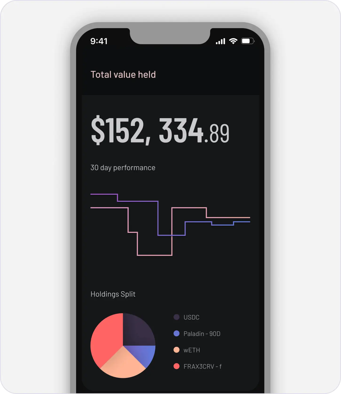
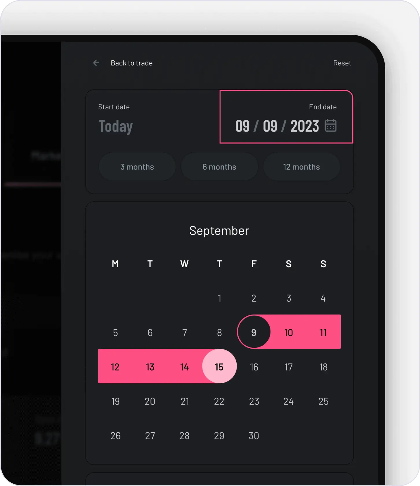
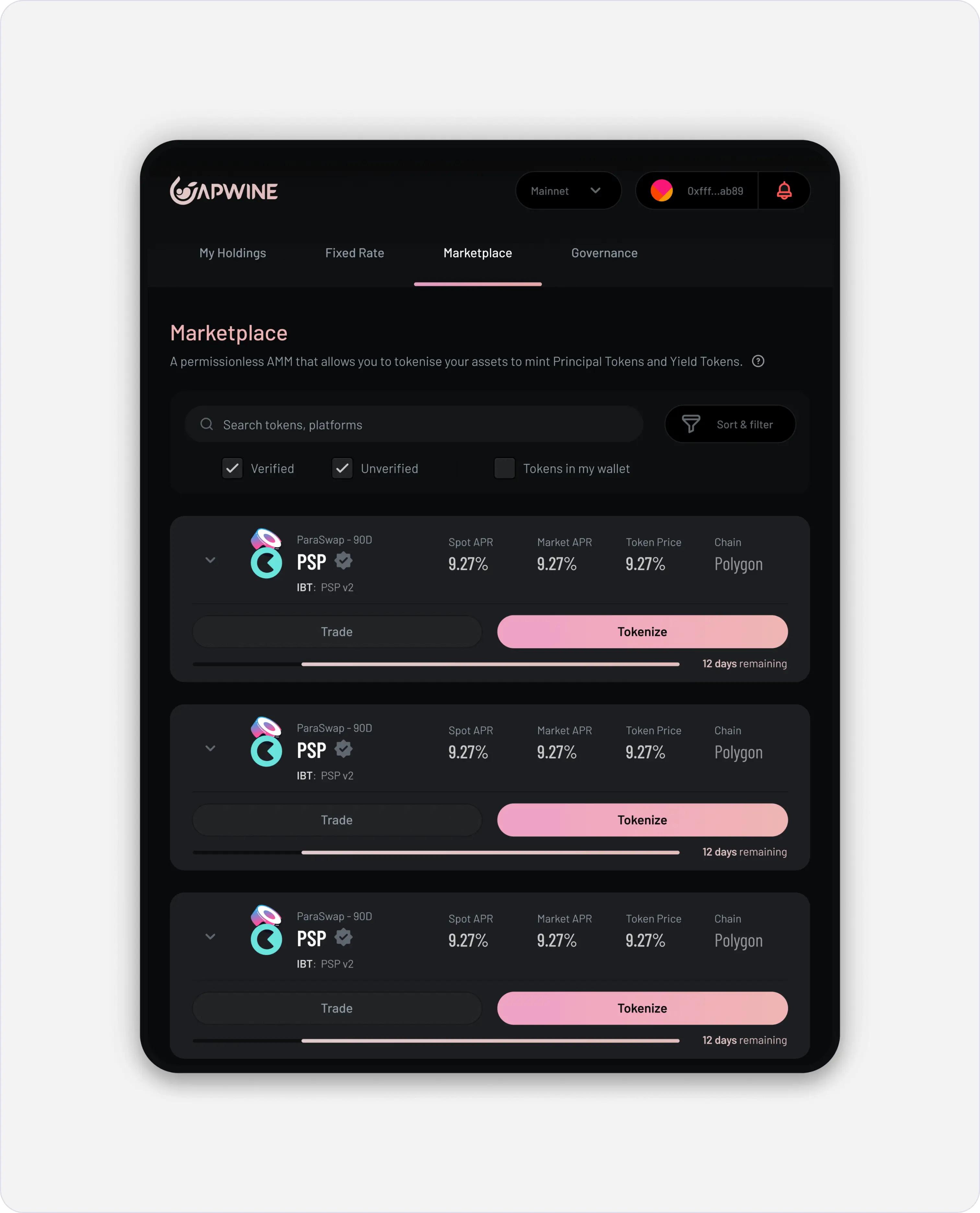
Custom dashboards, tailored calendar controls, and enhanced information layout resulted in a more streamlined and user-friendly experience.
Introduced a new brand name, logo, colors, and typography that better reflected the essence of the product.
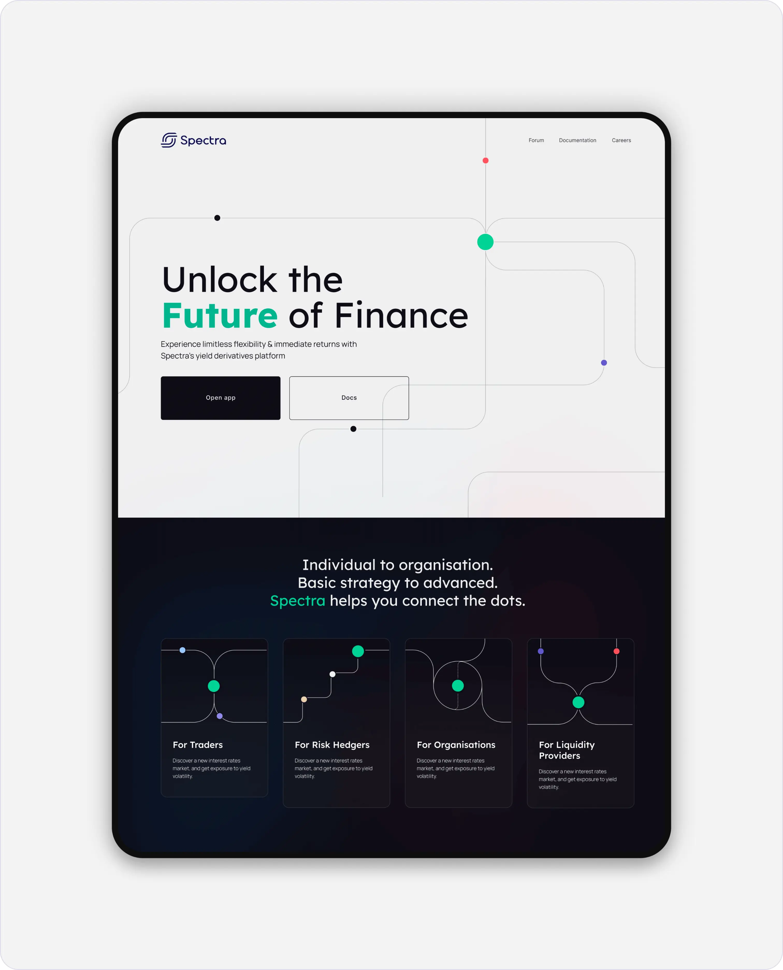
We embraced the concept that Spectra, akin to a junction, is central to the flow of tokens across various networks, forging valuable connections between previously independent components.
Let’s chat
We'd love to learn about you and what you are building
or